3 AM Cathrath
A downloadable game
This is version 2.01 of the game, updated on 6/30/24. Check the README for a full list of changes. If the fonts in the game display incorrectly, please install the fonts in the Font folder or listed on this page.
STORY
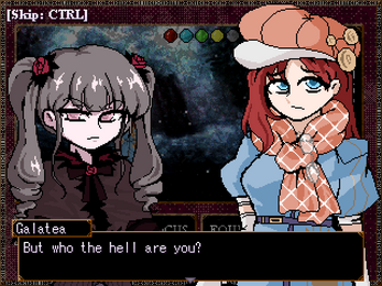
Residing in the misty city Cathrath for the time being, Galatea, the young disciple of the God Thes, receives an odd letter from him: somebody has been mass producing and circulating the immaculate objects of the land! Sensing that the source of the incident is near Cathrath, Thes orders her to investigate.
GAMEPLAY
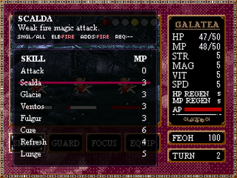
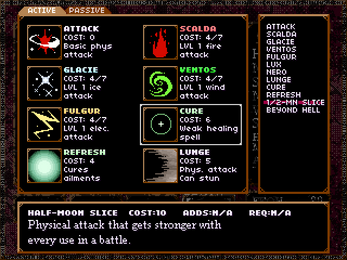
Galatea will do her best to fight through various hordes of enemies. As you progress through the game's various stages, skills and passives can be bought from a shop. Elements that are put onto the field can be used for powerful skills. This game autosaves your progress. You can continue a run even if you die, but...
CREDITS
MUSIC and SOUND EFFECTS
M-ART - G2-MIDI - soleil-musique - FREEDOM HOUSE
GRAPHICS
MEGATEN-like RPGM Sprites - VIPRPG Archive - First Seed Material - 白螺子屋
FONTS
04b03
| Status | Released |
| Rating | Rated 4.7 out of 5 stars (3 total ratings) |
| Author | ojosama |
| Genre | Role Playing |
| Tags | RPG Maker, Short |
Download
Development log
- 6/29/2024 Update: QoL + gameplay changesJun 30, 2024


Comments
Log in with itch.io to leave a comment.
Game crashed when I selected seven colored whateverthenamewas and moved to the right to try to select the target on the first encounter in the burning town (there was 2 dudes and a horse in the middle I think), I technically also pressed up or down before starting to pick a target I think?
Neat game tho
This game rocks so much! My only complaint is that the menus scroll a bit too fast so I have to quickly tap the key to select the options I want. But I love the art, the music, and the gameplay a lot. This was a pleasant surprise to come across entirely at random.
Hello,
I streamed your game this past weekend. Overall, I didn't hate the concept of it, but it lacks clarity and lacks the spice to encourage continued play.
The biggest most frustrating flaw that I think hurts this game the most is how obtuse and dense it is. With no tutorial whatsoever, but a wall of menu items and HUD elements, the game feels like opening an old cryptic tome written in another language. This feel really discouraging at first, because fights are trial-and-error, but not really trial-and-error in a sense of learning enemy patterns and attacks, but more in a sense of just figuring out what menu items do.
On top of that frustration is the font and a very unfortunate menu buried in the equip screen. When the font is rendered small, many letters become garbled messes of pixels, making things difficult to read. Coupled with poor kerning between lines, and my eyes begin to go crosseyed just trying to figure out what things say.
That said, I like the concept at the foundational level of this game. There is something satisfying of deciding what stats to upgrade when you reach the shop or deciding what objects to buy. As is typical with this game, a lack of description makes shopping feel unnecessarily stressful since as the player I can only assume what the stats mean, but without any tutorial to give concrete information about the stats and skills I am left to my own devices. I would play more if there was more to break up the loop of fight-shop-fight. Even if it was a short hallway between fights for players to catch their breath I think that would go a long way. In addition, I think incorporating rogue-lite elements may be beneficial to the surprises the game can throw.
If you'd like to watch my experience with your game, I've linked the archive below. You can click the timestamps to jump to when I start playing your game.
Hello, thanks for playing the game and apologies for the late reply! Thank you for the feedback as well.
The game was designed around multiple playthroughs (a single run is about an hour long), so the player should learn the mechanics of the gam e as they try out different options over the span of several runs. I'm personally not a fan of in-game tutorials myself. That said, I'd consider putting in a short image manual for players to explain what the different parts of the interface represent. I am considering putting in non-combat segments between the battles too, since I have had a lot of people comment on how drawn-out the game feels--having something like that would definitely help with the feeling of being overwhelmed by the amount of battles.
The font issue seems to be caused both by not having the font installed and not having it in the folder; I'll have to include it in the next release of the game.